Pancakes give me the crepes.
Posted: February 17, 2015 Filed under: Personal Scrapbook | Tags: illustration, pancakes, sketches 2 Comments
Yes pancake mix, I can’t seem to make fresh pancakes from scratch, don’t judge.
Current Obsessions.
Posted: February 12, 2015 Filed under: Personal Scrapbook | Tags: art, illustration, sketches Leave a commentSoda Candy Crush Saga, Pina Coladas and messy buns… just to name a few.

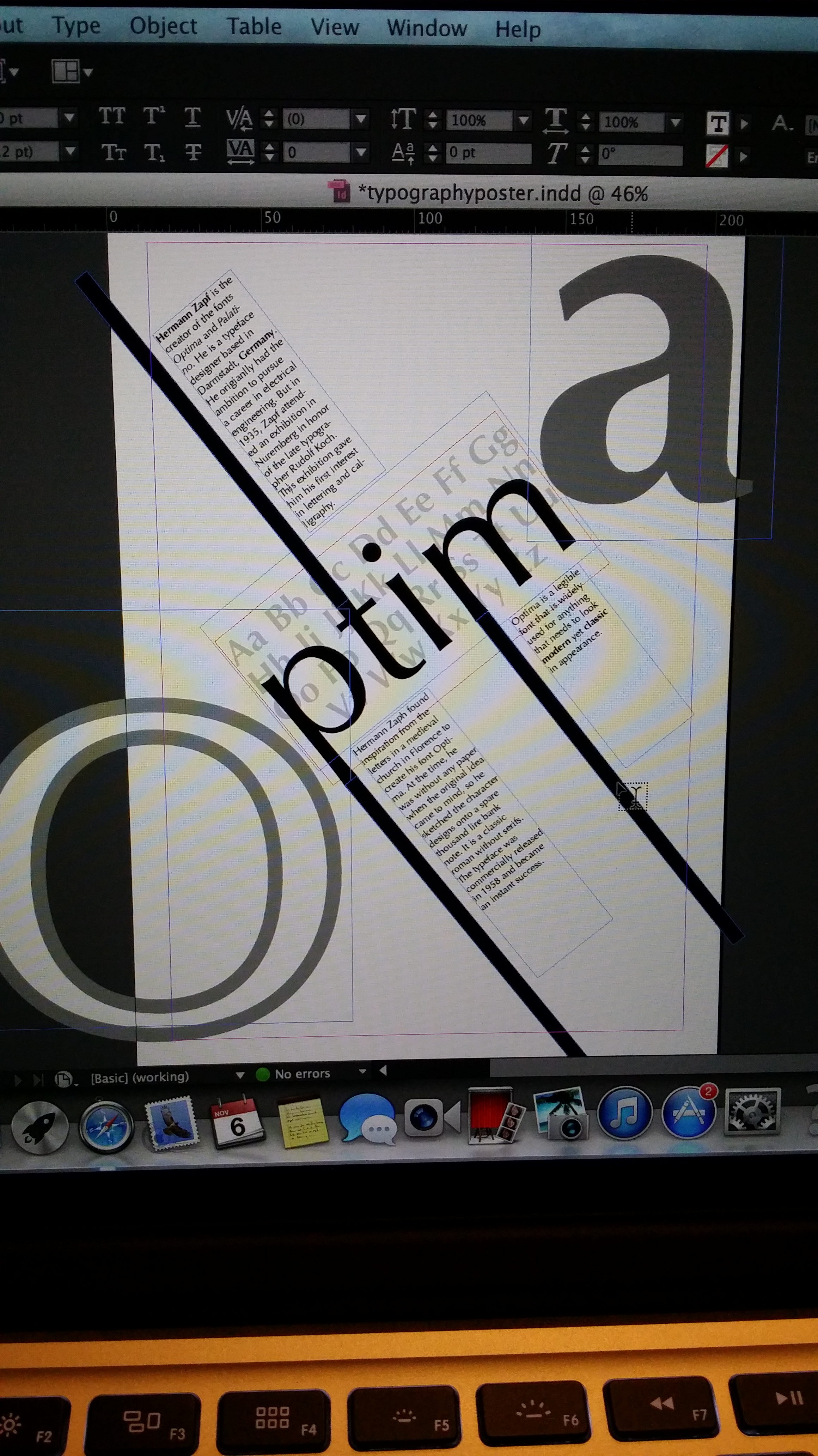
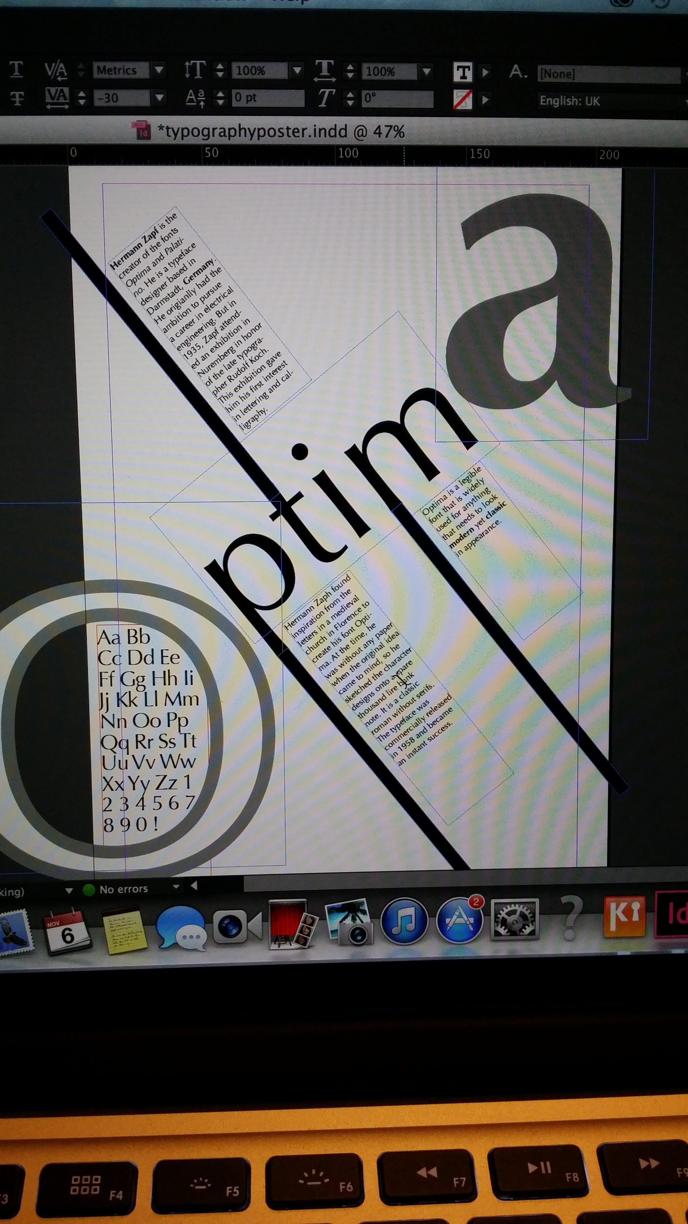
Project II: Type Specimen Poster.
Posted: November 10, 2014 Filed under: Subject | Tags: graphicdesign, poster, sketches, typography Leave a commentOur next project is the Word segment of the course where we are expected to produce a typography poster using the software InDesign. We are starting off by doing some research work. I went online to find a few examples of typography posters to draw ideas from and to help inspire me to come up with a design of my own. 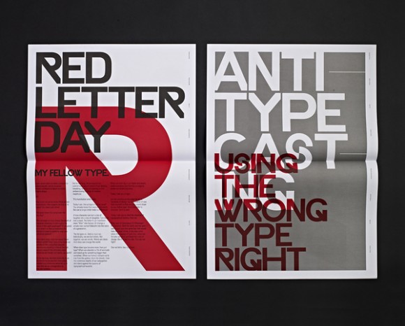
What I like about this poster is the big, bold text. They’ve used a limited colour palette for the whole poster to emphasise the letters to make it more dramatic and make it a focal point. I like how they’ve overlapped the lettering but still able to keep it readable. It’s very ‘to the point’. I think the overall look is quite urban, it reminds me of street art and graffiti work.
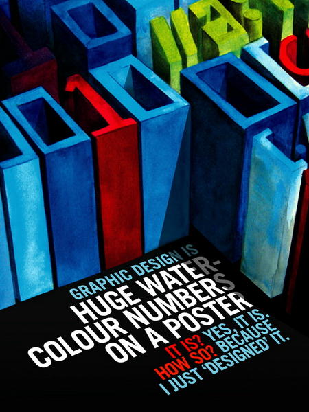
What captured my attention on the next poster is the play of 2D and 3D lettering. I find it rare to see this in generic typography posters these days, they’re normally very blocky, flat and 2D. I just like the fact it is quite a fun and unique design.
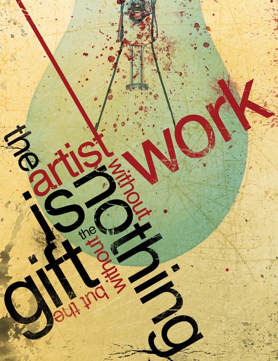
I really love this type of design. I like the whole angling, sizing and colour of words as well as the whole composition of the poster. It looks edgy and modern. I think the lettering is cleverly arranged so that not only does it look good but its also legible. I think this could be very versatile and fun method to play around with.
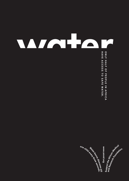
I really like the simplicity of this design. I find the monochromatic design and the cropping of the letters of the title extremely eye catching and bold. The design is intelligent as it matches what the poster is trying to advertise.
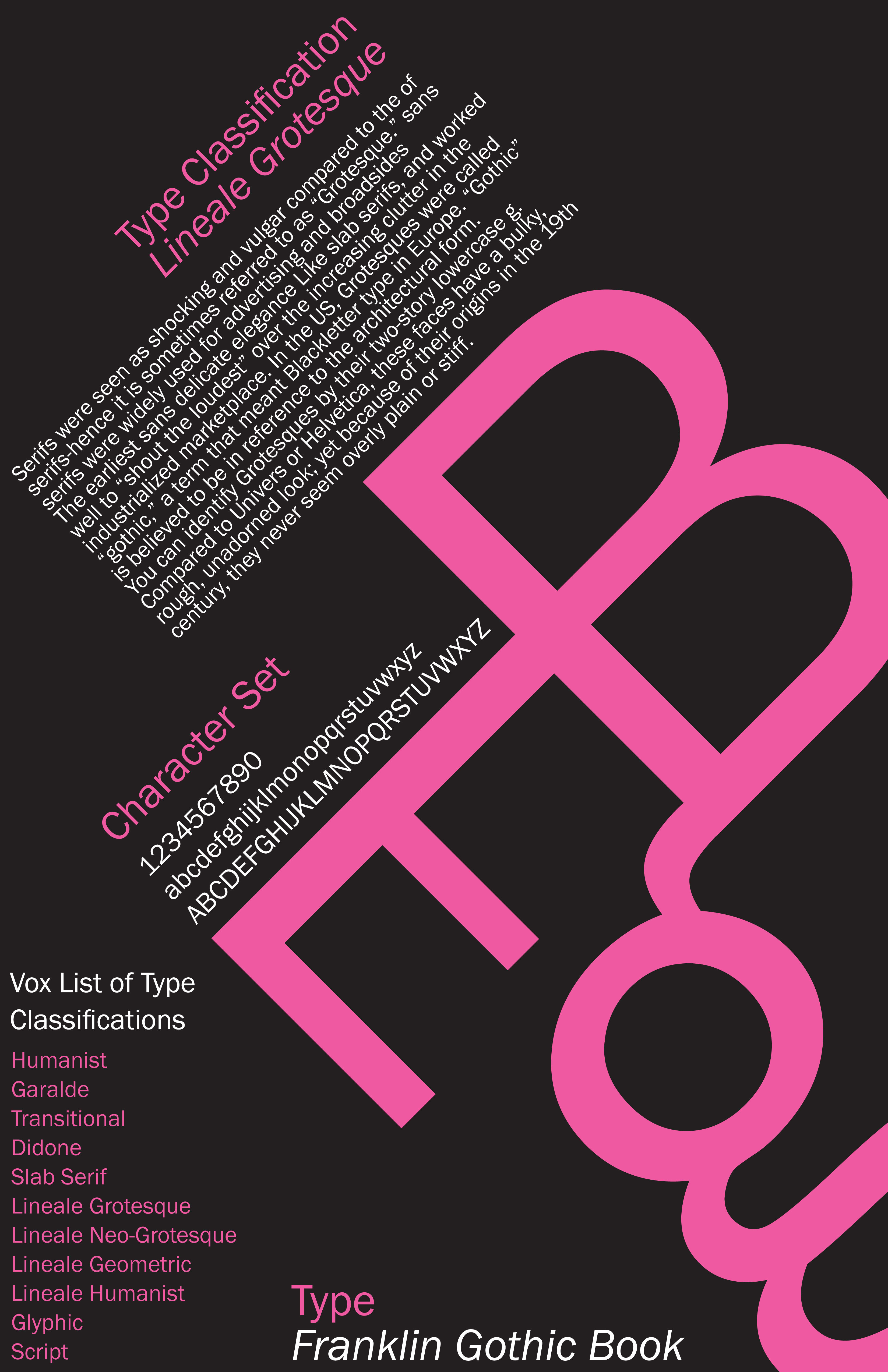
I think this poster best matches what our project brief is all about. It concentrates on the letters of the font as the main focus with the big, bright pink B, E and g. It includes paragraphs of text and the character sets. All of which are nicely displayed with interesting composition. Again, like the first poster, the colour palette is limited to make certain areas stand out and capture the viewers attention drawing their eyes the certain points first.
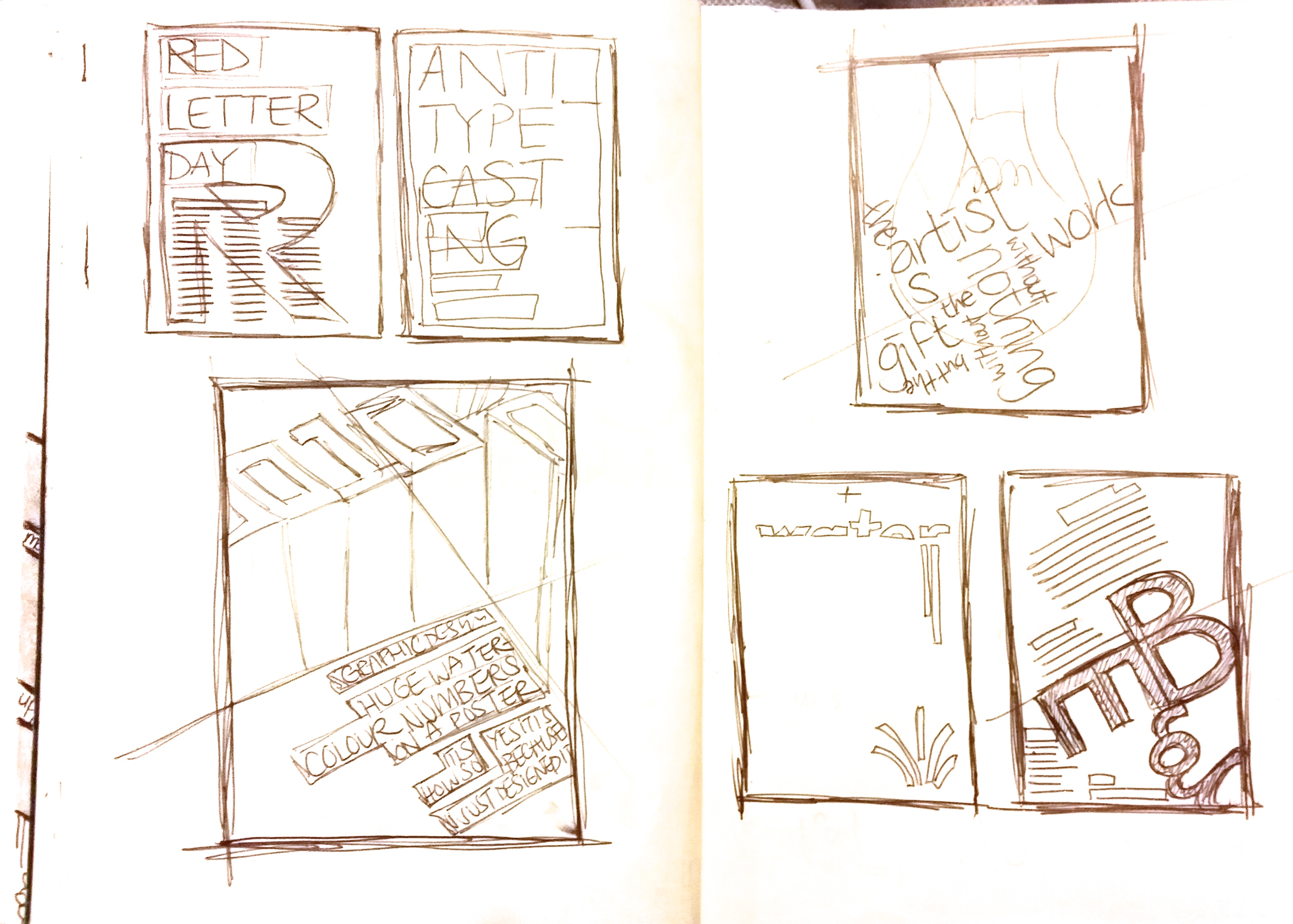
I sketched out the five poster designs very quickly and briefly into my sketchpad just to see the different types of layout. Exploring the different compositions, alignment, angling and various design ideas to hopefully help me construct quick design sketches of my own.
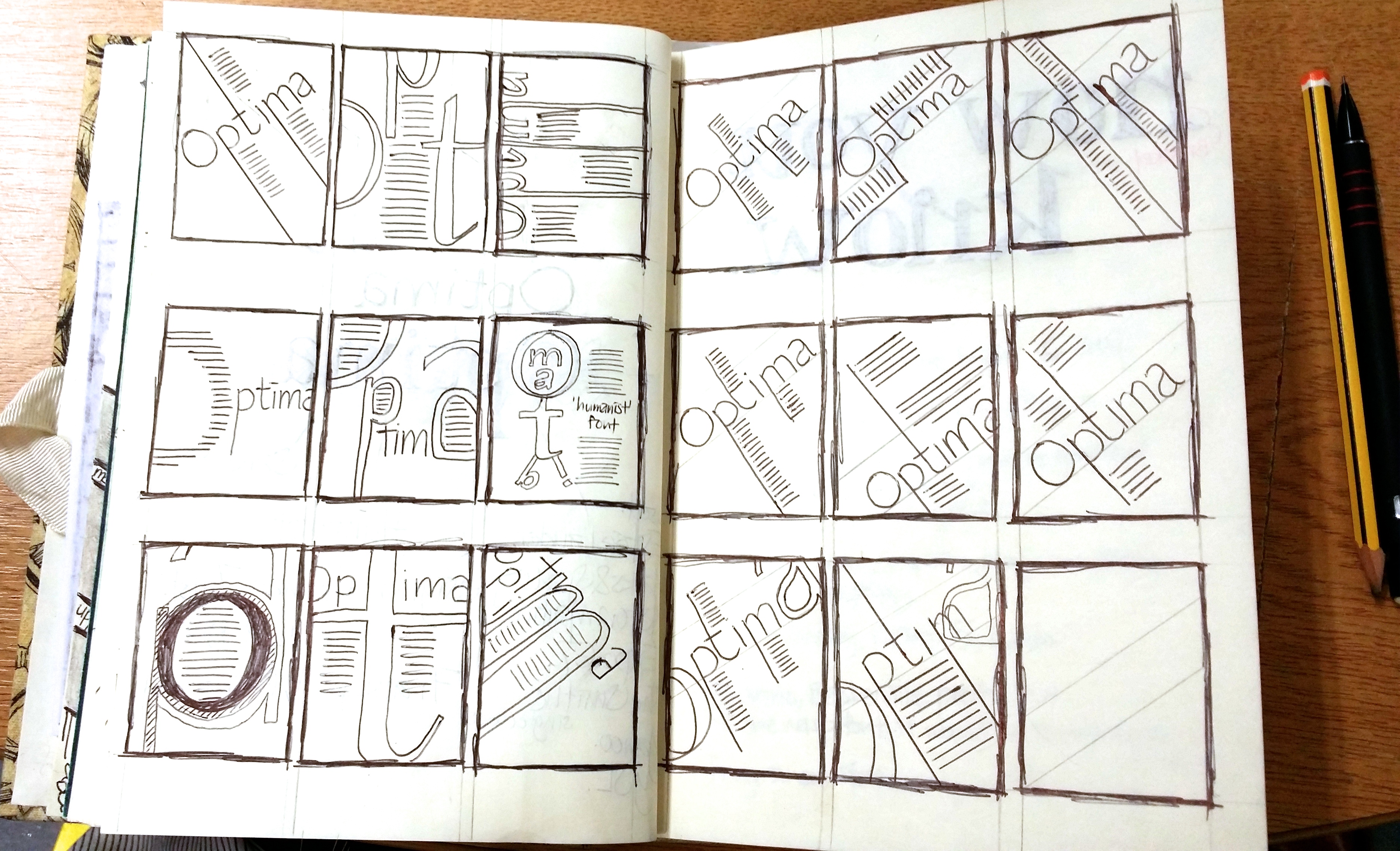
Following from the research work, I created a few thumbnail designs for my font Optima.
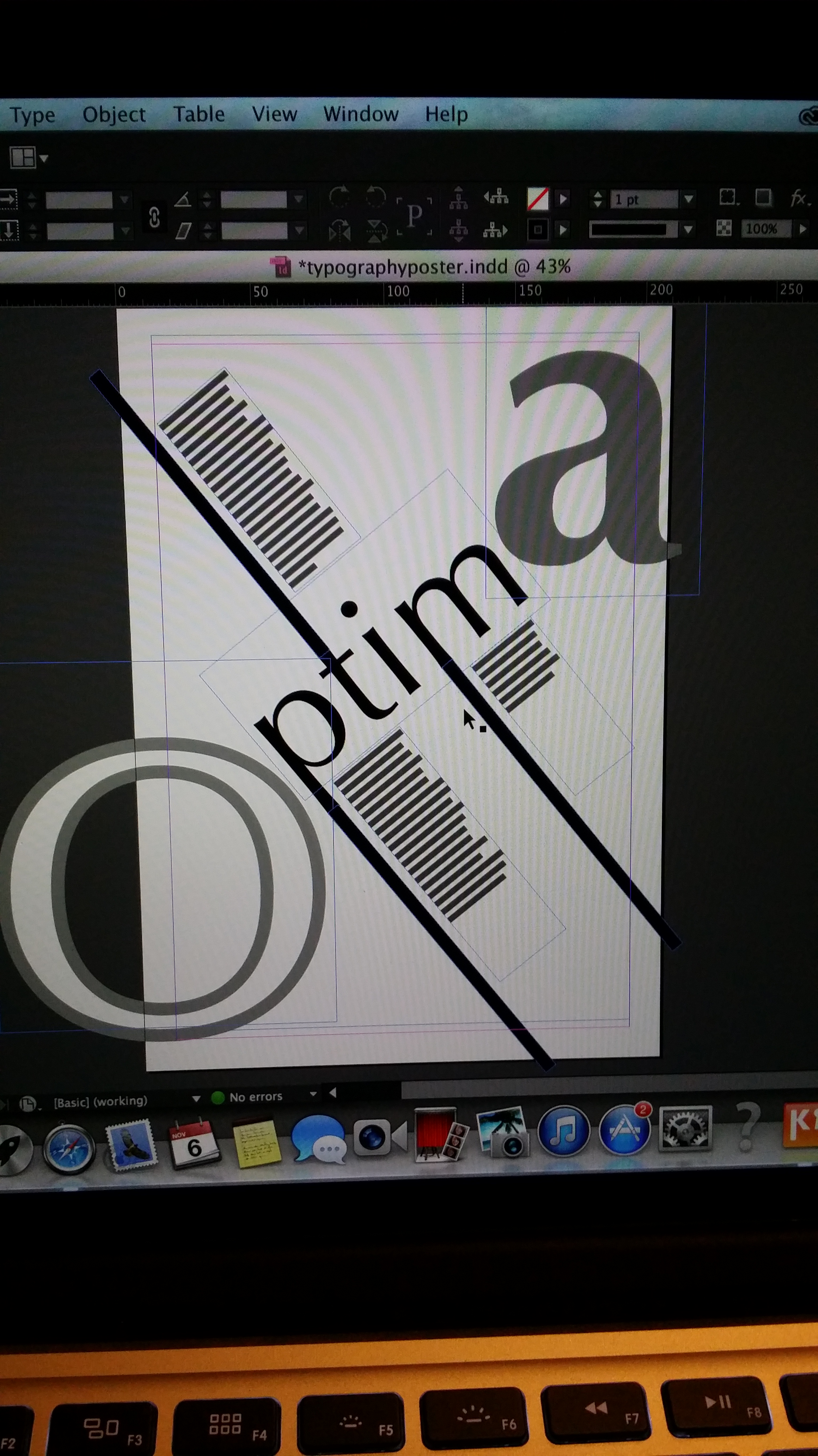
I then transferred and developed my ideas onto InDesign.
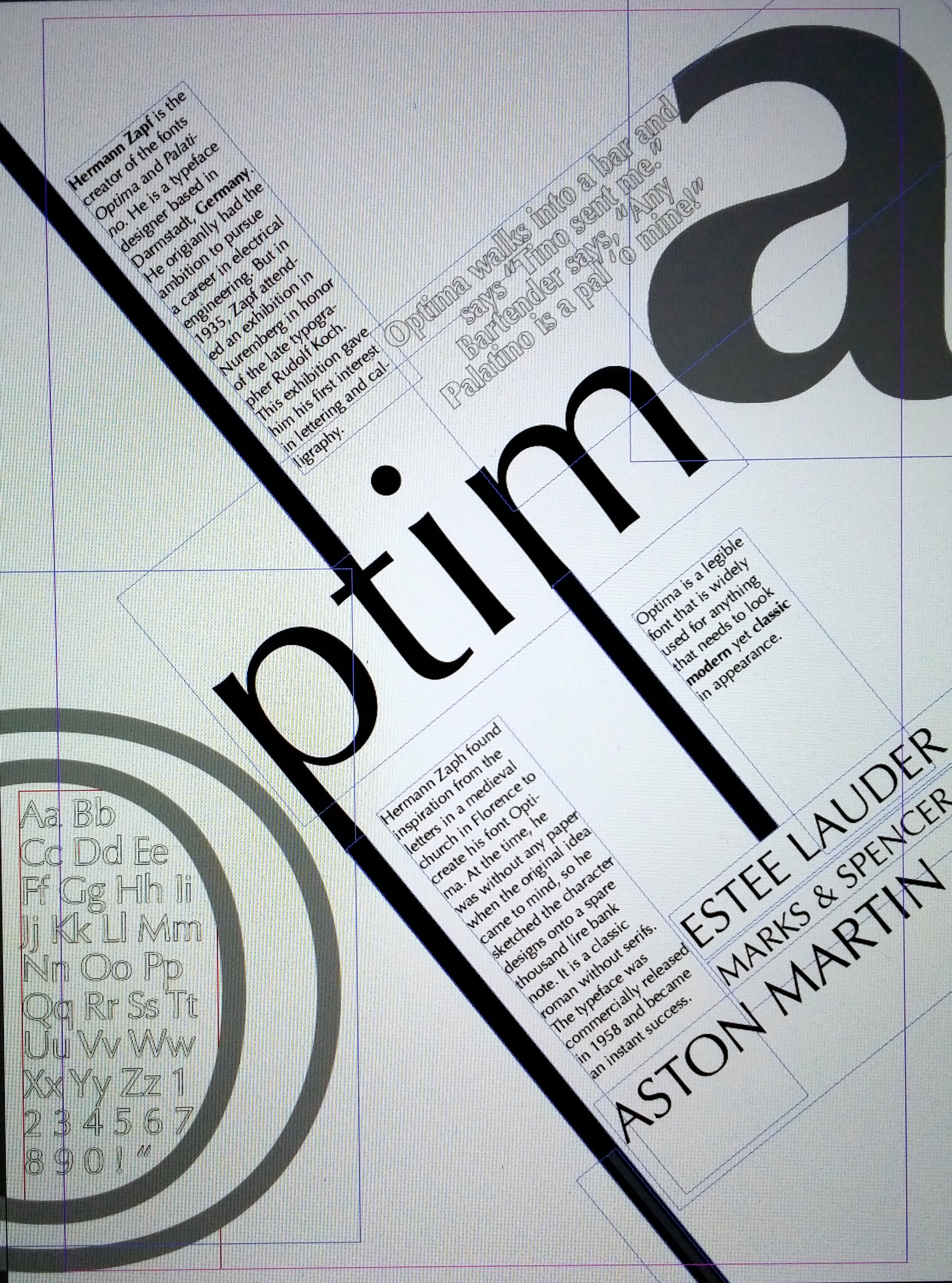
I like my poster but I would like to improve upon it. I feel that not enough lessons or workshops were included for this project. For the last project we had a lot of lectures that connected to the project and useful reviews that built up the the final design. As a beginner in InDesign I really struggled to be creative for this project. It was very restricting as I didn’t fully know how to use the software and was wary of making mistakes, which explains my very simple design. But overall, I think it’s an alright first attempt.
Typography Introduction.
Posted: October 23, 2014 Filed under: Subject | Tags: graphicdesign, sketches, typography 1 Comment
So during this lecture Olwen talked about Typography. She went through different typefaces and various typographic terminology.


She then continued onto the different movements of typography, how it progressed and changed throughout the years.
- Art Nouveau.

- Arts and Crafts

- Futurist

- Dadaism

- De Stijl

We were then set an exercise. We had to choose four letters of our choice:
- one uppercase serif
- one lowercase serif
- one uppercase sans serif
- one lowercase sans serif
Then we divided A3 sheets of paper into six equal squares. Within each square we had to create patterns, shapes, interesting compositions with the letters of our choice. 

What is Type.
Posted: October 20, 2014 Filed under: Subject | Tags: graphicdesign, illustration, sketches, typography Leave a commentToday we were given the task of researching typographic terms. We had to find examples of them and document them.


Image Project: Creating. (3/3)
Posted: October 15, 2014 Filed under: Subject | Tags: art, collage, graphicdesign, illustration, poster, sketches Leave a commentFor my poster design I have decided to use three main scenes: the famous scene from the movie Titanic (to represent wealth in love and relationships), the opening shot from TV show Friends (to represent wealth in friendship) and lastly a screenshot of Carol Vorderman on gameshow Countdown (to represent wealth in knowledge). I’m so excited to try this out. I’m actually giggling to myself thinking about the final outcome.
Firstly I sketched rough drawings of the scenes on A4 sketchpad using photos I found on google from my laptop.

I left out the heads as I will be collaging over them later on.

I wanted my drawings to have tone so that there would be more depth to the poster rather than just a flat, simple, outline drawing. If you look closely at the notes you can see the images are different shades of light and dark tones by shading effects such as dotting, lines and cross hatching so I decided to incorporate this into my drawings.


I’m pleased with how my drawings look. At a glance, even without the heads, you know exactly what the image scenario is meant to represent.
Next I used PhotoShop to cut out images of the Queen’s head, as well as other various faces from pound notes, and pasted them on top of my drawings.


I was actually crying laughing while doing this. I absolutely love the way they have all turned out. I highly debated whether to put colour into my illustrations to match the faces but I think leaving them black and white creates a nice contrast between the two.
Finally, after playing around with the various different compositions, when I was happy with how they were placed; I merged my three images together onto A3 to finish off my final design.

The main message I wanted to convey with my poster is that money is primarily the focus initially when you think of the word ‘wealth’, which is why I chose to have the faces in bright vibrant colours to capture the viewers’ attention first. They will automatically think “oh, it’s something to do with money” but as you look deeper.. there’s a different meaning to it.
Like I said previously, there’s all different types and variations of what wealth means to different people. I’ve just chosen love, friendship and knowledge as examples for my poster. I want my poster to trigger thoughts so that wealth doesn’t have to be viewed as materialistic possessions and money.
Image Project: Brainstorming. (2/3)
Posted: October 15, 2014 Filed under: Subject | Tags: brainstorm, graphicdesign, illustration, sketches Leave a comment
I struggled extremely hard to come up with an idea for my poster. Like ridiculously. I came up with so many different words to do with wealth but couldn’t pin-point anything in particular that I wanted to use within my poster.
I liked the idea of ‘growth’. The fact that wealth is something you grow. Whether it be in money, happiness, knowledge, power etc.
I started sketching a few more poster ideas. I used images of plants, growth rings in trees, ladders, magnifying glasses.. objects that makes things ‘grow’.

But I honestly still wasn’t convinced they were good designs. They still seemed boring!

I then looked into the idea of origami – possibly folding a 20 pound note into shapes.
Again, I wasn’t happy. It didn’t blow me away and it wasn’t something that people would look at and remember.
After staring at my 20 pound note for minutes and the Queen’s face staring straight back at me.. a idea finally popped into my head.
I want to use the faces on the notes as part of a story/scenario I’ll create. I want to use well known scenes/scenarios from movies, tv shows etc to convey a meaning of what wealth is. Eventhough collaging faces onto someone else’s body has been done countless number of times throughout the years.. it’s still, in my opinion, a humorous and effective way of making people laugh as well as helping images stick in their minds. Therefore, although I originally wanted to steer clear of the obvious, I’m attempting to use it to my advantage and create a poster that represents wealth in a predictable – but not really kind of way. 😉
Image Project. (1/3)
Posted: October 8, 2014 Filed under: Subject | Tags: art, doodles, graphicdesign, illustration, sketchbook, sketches Leave a commentWe’ve been set our first project brief. I’m rather excited about it. Similar to the museum project, we are given one word and we must create a poster of that word in image form (no text allowed).
My word is WEALTH.
I feel I can have a lot of fun with this because it can have many interpretations of what it could be/mean to different people..
I asked friends what it means to them via. snapchat haha.


Quite diverse answers.. the majority link wealth with money.
I then quickly drew a few notes and ideas onto sketchpad.

At this point I’m still experimenting with different ideas, concepts, message and haven’t quite come to a final outcome.
Although I know I would prefer to steer clear from the obvious. My ideas so far are ‘too obvious’ and I wish to create a piece that makes to viewers look more inquisitively and question what the poster is trying to communicate. I want it to be memorable and linger in peoples’ minds.
Sequence Visuals.
Posted: October 2, 2014 Filed under: Subject | Tags: art, comic, doodles, illustration, sketches, storyboard Leave a commentWe were given a task of creating a storyboard of a sequence of 16 quick sketches of our typical morning getting to Uni.

I found this to be extremely enjoyable. Before university I would create comics and storyboards in my spare time for fun so this exercise was second nature to me. I like how free and how much fun I could have producing this. I tried to make it quite comical by exaggerating a lot of actions. I wanted to show the importance of time in my story so displayed a clock in each scene to show the countdown to my arrival to my lecture and some of the struggles that I encounter along the way. #thestruggleisreal
