iStopMotion Animation.
Posted: December 1, 2014 Filed under: Subject | Tags: animation, art, graphicdesign, illustration, storyboard Leave a commentBack To The Future Animation:
Bookmaking.
Posted: November 13, 2014 Filed under: Subject | Tags: art, artistbooks, bookmaking, graphicdesign, illustration Leave a commentWe had a session with Sarah on bookmaking. She talked to us about the different formats a book can take and also what books could contain.

She then gave us a tutorial on the quickest and simplest way of creating a book using a single sheet of A4 paper. She showed us an 8-fold version and a 16-fold version.


From those tutorials we had a chance of creating our own artist book. The criteria was to either create an alphabet book or a book based on a nursery rhyme. I chose to base mine on the nursery rhyme Hickory Dickory Dock.
I decided to use my ready-made 8-fold book as a template. I wanted to try the cut-out method for creating my artist book. I firstly cut my book into the shape of a simple vintage ticking clock. I then drew a focal point for each page which I decided would be the clock face. I finally cut into each clock face using a scalpel to create an intricate and delicate design to narrate the story.


I’m extremely proud of my design, I’ve got to be honest. I didn’t get a chance to finish it by the time our session ended but I think it looks really impressive so far and I’m definitely going to try to complete it in my own time.
The next part of the session was to create a book from scratch. We learned the sewing techniques to bind the pages together (using the 3 hole technique and the 5 hole technique), how to create the cover of the book, how to create the spine and finally how to combine it all together.


Artist Books.
Posted: November 13, 2014 Filed under: Subject | Tags: artistbooks, graphicdesign Leave a commentAfter our lesson with Olwen we headed up the the library to meet up with Doreen. She showed us a variety of artist books, all of which were individually unique and interesting.


Below was my favourite artist book from the collection shown. I think it’s extremely clever how they’ve used various different methods to construct the book. It’s very simple, using envelops and newspaper cuttings to create pop ups and concertina pages along with a cute hidden personal letter in the back pocket for the reader. I just found it overall cute and sweet.


I found this session to be extremely interesting. I love how creativity can really be pushed here with artist books and how fun and interactive they can be. The artist is able to explore a diverse amount of things without much restriction when creating their own book, there really aren’t any rules. They can experiment with size, shape, materials, how the pages turn/fold/overlap/pop up etc. how the font is printed/written/collaged etc. the possibility is pretty much endless. It makes me excited to start this new segment of Bookmaking and Storytelling.
Project II: Type Specimen Poster.
Posted: November 10, 2014 Filed under: Subject | Tags: graphicdesign, poster, sketches, typography Leave a commentOur next project is the Word segment of the course where we are expected to produce a typography poster using the software InDesign. We are starting off by doing some research work. I went online to find a few examples of typography posters to draw ideas from and to help inspire me to come up with a design of my own. 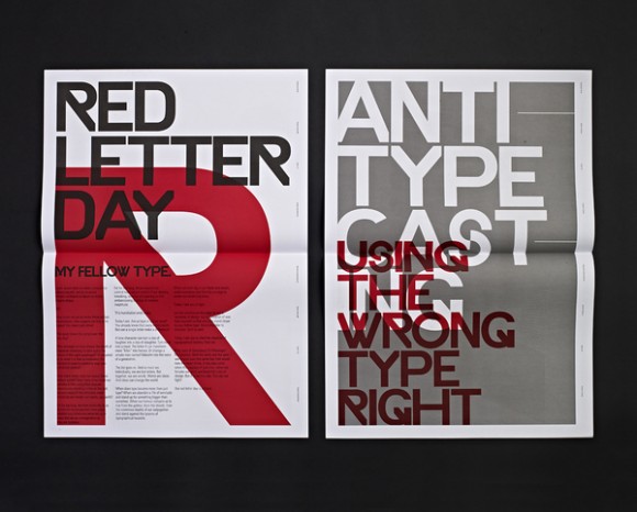
What I like about this poster is the big, bold text. They’ve used a limited colour palette for the whole poster to emphasise the letters to make it more dramatic and make it a focal point. I like how they’ve overlapped the lettering but still able to keep it readable. It’s very ‘to the point’. I think the overall look is quite urban, it reminds me of street art and graffiti work.
What captured my attention on the next poster is the play of 2D and 3D lettering. I find it rare to see this in generic typography posters these days, they’re normally very blocky, flat and 2D. I just like the fact it is quite a fun and unique design.
I really love this type of design. I like the whole angling, sizing and colour of words as well as the whole composition of the poster. It looks edgy and modern. I think the lettering is cleverly arranged so that not only does it look good but its also legible. I think this could be very versatile and fun method to play around with.
I really like the simplicity of this design. I find the monochromatic design and the cropping of the letters of the title extremely eye catching and bold. The design is intelligent as it matches what the poster is trying to advertise.
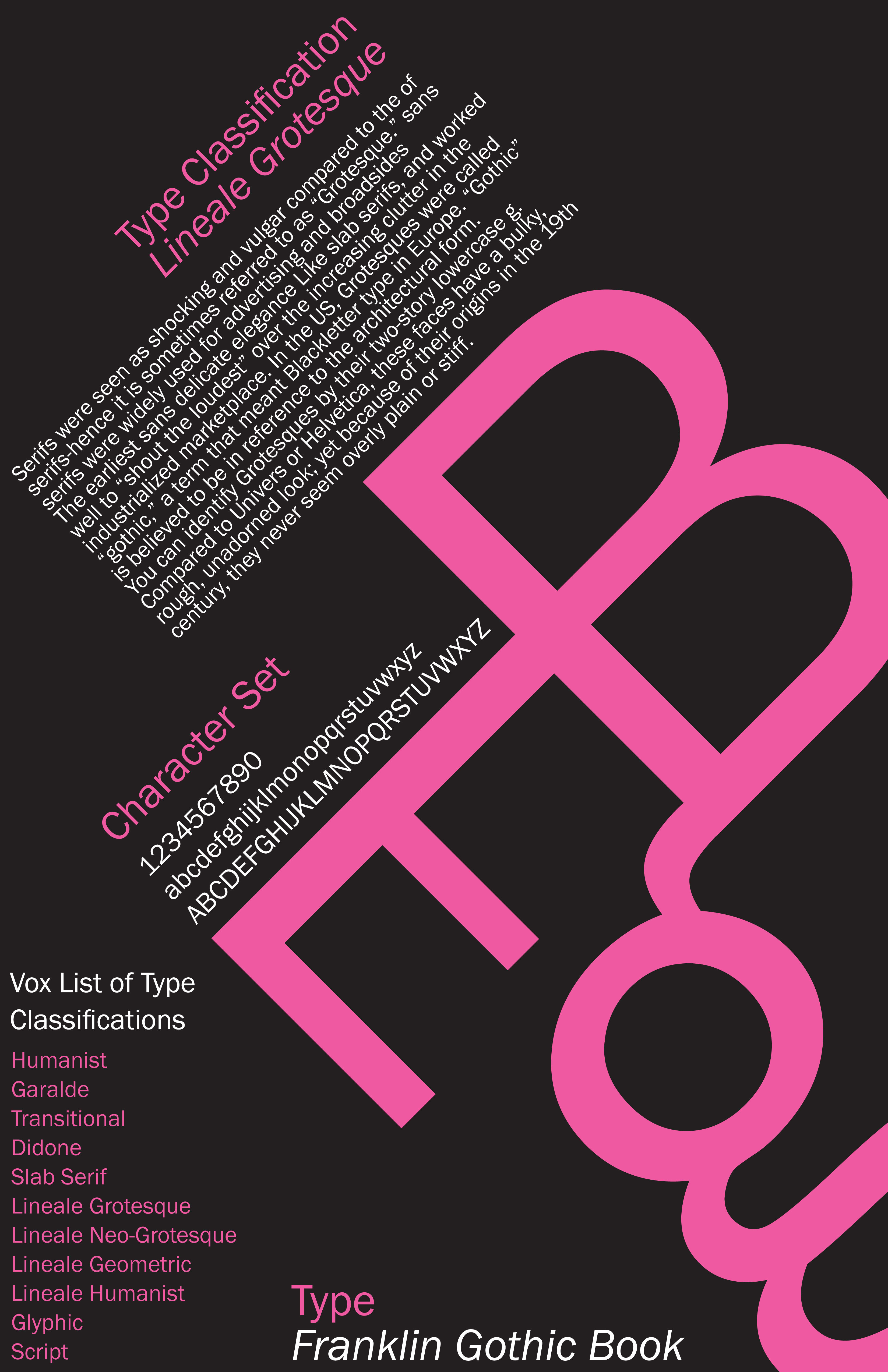
I think this poster best matches what our project brief is all about. It concentrates on the letters of the font as the main focus with the big, bright pink B, E and g. It includes paragraphs of text and the character sets. All of which are nicely displayed with interesting composition. Again, like the first poster, the colour palette is limited to make certain areas stand out and capture the viewers attention drawing their eyes the certain points first.
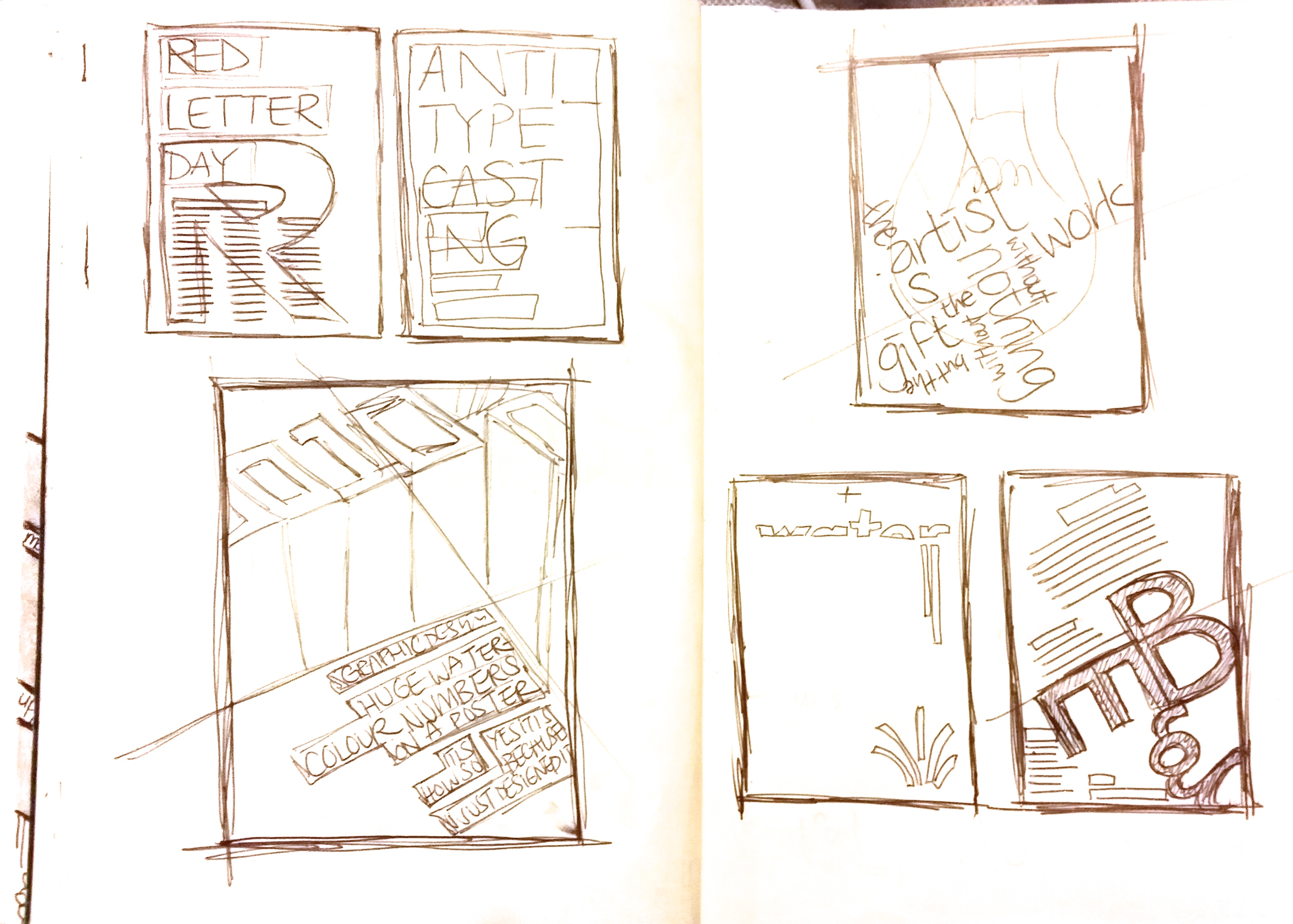
I sketched out the five poster designs very quickly and briefly into my sketchpad just to see the different types of layout. Exploring the different compositions, alignment, angling and various design ideas to hopefully help me construct quick design sketches of my own.
Following from the research work, I created a few thumbnail designs for my font Optima.
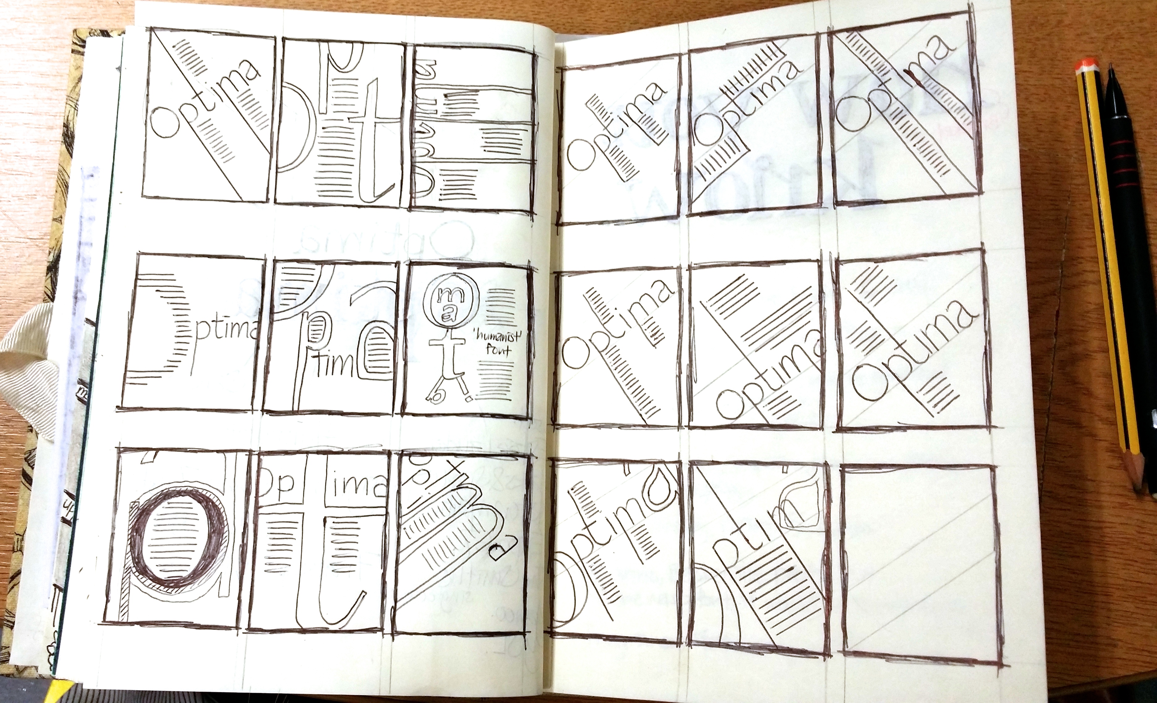
I then transferred and developed my ideas onto InDesign.
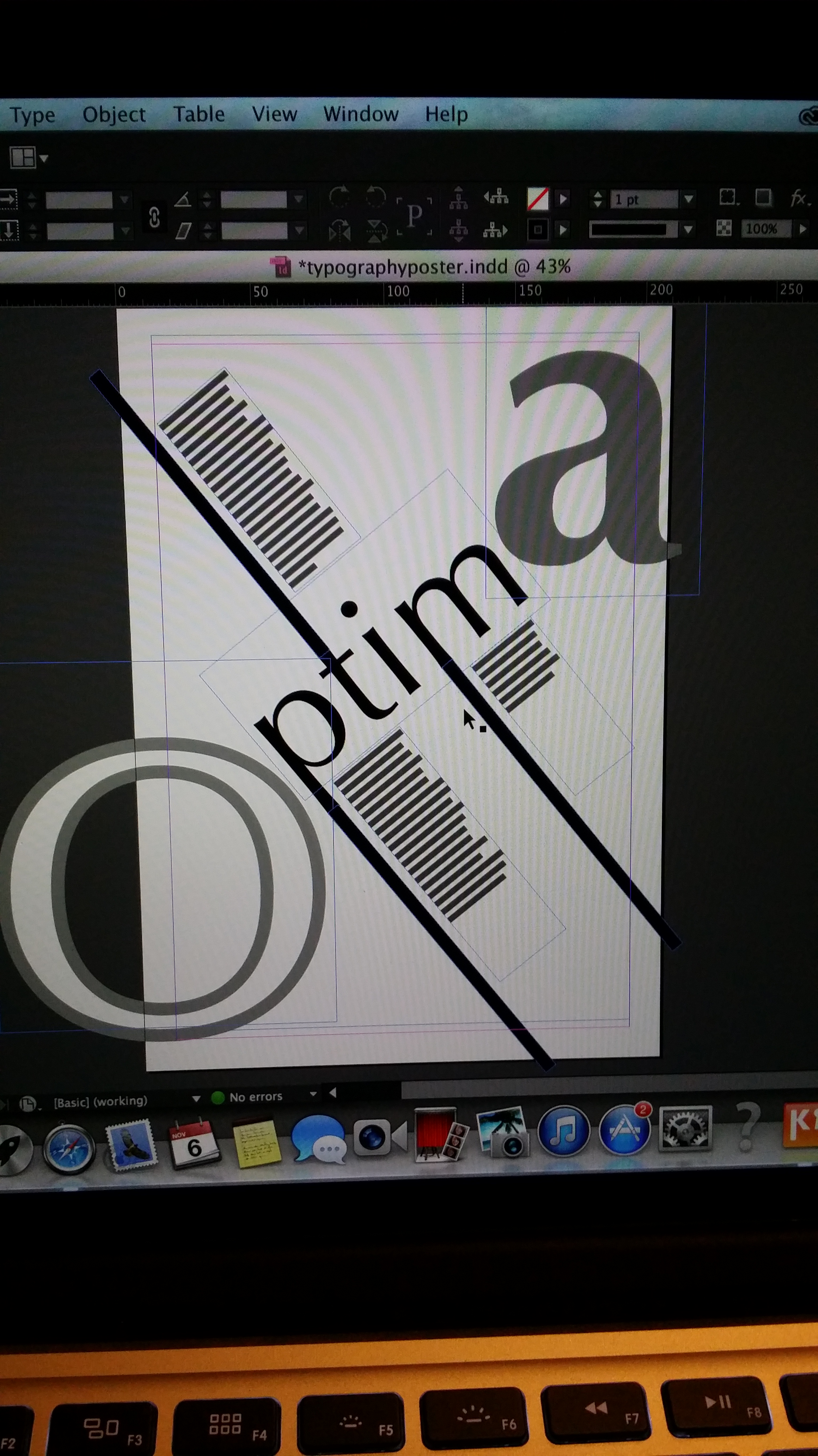
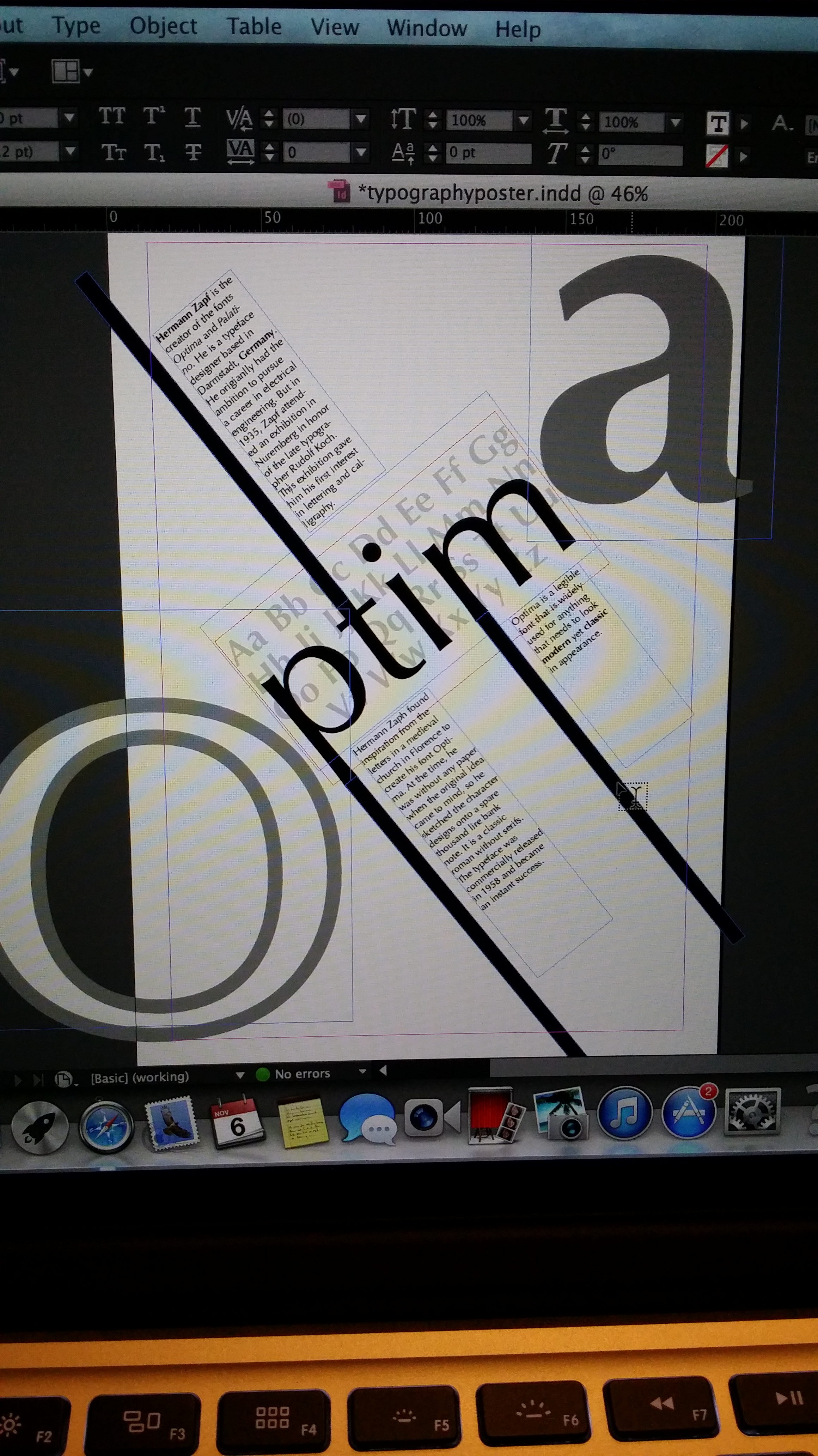
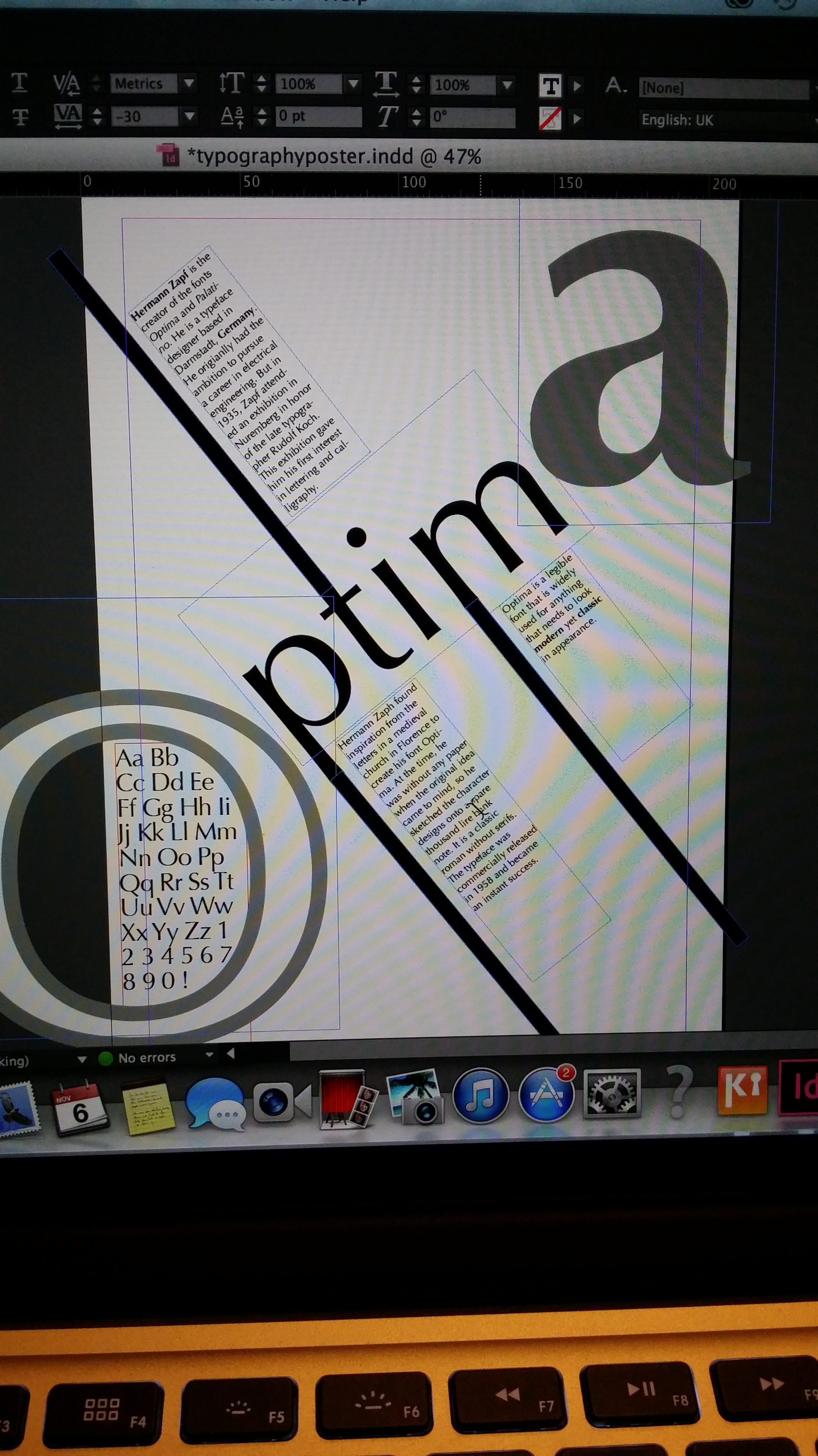
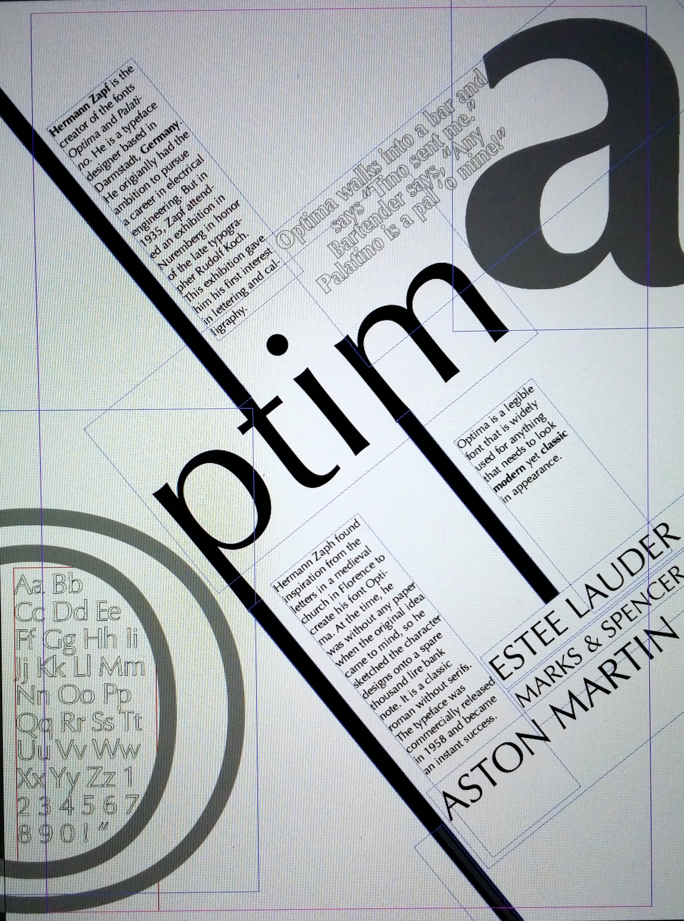
I like my poster but I would like to improve upon it. I feel that not enough lessons or workshops were included for this project. For the last project we had a lot of lectures that connected to the project and useful reviews that built up the the final design. As a beginner in InDesign I really struggled to be creative for this project. It was very restricting as I didn’t fully know how to use the software and was wary of making mistakes, which explains my very simple design. But overall, I think it’s an alright first attempt.
Workshop: Laser Cutting.
Posted: November 10, 2014 Filed under: Subject | Tags: graphicdesign, lasercutting Leave a comment


This week’s workshop was laser cutting with Steve Murray. We were asked to create a simple design on illustrator beforehand ready for our tutorial. It had to be saved as a CC2 file in order to be used on the laser cutting software. We sent our designs to the machine to cut onto paper first so that we could see how the design would transfer before actually using PVC/MDF woodblock. If there were any tweaks to be made we could alter and send it through again.
I am really happy with my design. I’d like to see what it would look like on different materials such as woodblock.
Six Word Stories.
Posted: November 6, 2014 Filed under: Subject | Tags: graphicdesign, sketch Leave a commentFor this exercise we were asked to think of a memorable event/story that has happened to us or a family member or a friend. We then had to condense the story to as little as six words.
 “Don’t fall asleep! Cereal on lap!”
My first story was about a friend who, in the summer, went out into the garden to sunbathe. She was eating her bowl of cereal and once finished fell asleep with the bowl of cereal on her lap. You already know what happens next..
She woke with an amazing tan.. along with an amazing tan line of a cereal bowl and spoon around her crotch area. Needless to say, she couldn’t wear shorts for the rest of the summer.. bless.- “Anything to declare? Teabags, 80 teabags!”
My second story was when I booked a flight to America for the first time. I was off to visit my family in Canada for two weeks. My mum had asked me to take a box of teabags over for my uncle as they don’t really have the luxury of a good ol’ english cuppa’ tea over there and so I agreed. Once I landed at the airport, I suddenly remembered all the stories about American airports being extremely strict at customs and you’ll get in trouble for bringing certain foods into the country. So the nearer I got to the customs-man and the more signs I started reading whilst in the queue about fines and prosecutions the more nervous and scared I got. My heart was racing. Then upon reaching the customs-man where he firmly asked “Anything to declare Miss?”, I yelled “Teabags! ….eighty of them!”. Oh the shame.
Expressive personality.
Posted: October 30, 2014 Filed under: Subject | Tags: graphicdesign, typography Leave a commentFor this exercise we had to pair up with someone in the class that we ‘don’t know that well’. I paired up with Zarna, who I have spoken to briefly on a few separate occasions, which was nice because it wasn’t too awkward.. plus, Zarna is a really friendly, laid back and easy to talk kind of gal anyway so I was glad. 🙂
We basically had to ask questions, make conversation to find out more about the other person. What they like, what they dislike, what interests they have.. in general what kind of person they are and what their personality is like.
Once we thought we gathered enough information we had to create fonts of their full name to match their personality.
In the amount of time we had, I could only come up with three designs. I actually found this to be quite difficult. Mainly because initially I misinterpreted what was said. I kept thinking that we had to design a font to represent them, for example if they are a happy person I would’ve thought that I needed to use things like yellow smiley faces in the font, whereas they wanted us to create a more vibrant, brightly coloured, bouncy, curvy, rounded font to represent happy instead. Reading by how it’s written rather than what it contains.


I thought I’d post my attempts anyway.
- My first attempt I used a classic, times new roman-esque font in a semi circle shape to represent her ambitious personality. I used a bold, classic font in capitals to show a sense of importance and strength. I drew it in a rainbow semi-circle shape to make it look as though we’re looking up at it like a skyscraper effect to represent always aiming high. Additionally, because Zarna is one of two student reps. of our class she could be seen as someone to look up to and someone to aspire to.
- My second attempt I used a dotted lettering effect with black pen first and then blues, greens and a hint of purple in a flowing, whimsical motion in a dream like effect as she mentioned she is a bit of a ‘dreamer’. I think this was my best out of the three that matched the criteria. I really liked the way it has turned out.
- My third and final attempt the word I wanted to symbolise was ‘relatable’. I tried making all the letters of Zarna’s name all relate in some way. For example, you can see I tried to incorporate the ‘Z’ into the ‘A’ and also a sidewards ‘n’ and ‘A’ combined to create the letter R. I mixed and matched various letters together to create new letters. I really like the outcome and idea behind it, although I don’t think it’s as visually appealing as the other two.
We then had a review of everyone’s work and discussed what we liked, what made them work/not work. There were a few pieces that I really liked and caught my attention. I liked their use of colour and how only parts of the letters are revealed.


#CardiffTypeHunt #RevealConceal
Posted: October 27, 2014 Filed under: Subject | Tags: graphicdesign, typography Leave a commentWe got involved in Cardiff’s Type Hunt today. We were asked to go around Cardiff, in either pairs or groups of three, to take photographs of various types that we found interesting then to upload them onto Instagram with the hashtags #CardiffTypeHunt and #RevealConceal.
These were some of my favourites that I captured.


Typography Introduction.
Posted: October 23, 2014 Filed under: Subject | Tags: graphicdesign, sketches, typography 1 Comment
So during this lecture Olwen talked about Typography. She went through different typefaces and various typographic terminology.


She then continued onto the different movements of typography, how it progressed and changed throughout the years.
- Art Nouveau.

- Arts and Crafts

- Futurist

- Dadaism

- De Stijl

We were then set an exercise. We had to choose four letters of our choice:
- one uppercase serif
- one lowercase serif
- one uppercase sans serif
- one lowercase sans serif
Then we divided A3 sheets of paper into six equal squares. Within each square we had to create patterns, shapes, interesting compositions with the letters of our choice. 

What is Type.
Posted: October 20, 2014 Filed under: Subject | Tags: graphicdesign, illustration, sketches, typography Leave a commentToday we were given the task of researching typographic terms. We had to find examples of them and document them.


