Project II: Type Specimen Poster.
Posted: November 10, 2014 Filed under: Subject | Tags: graphicdesign, poster, sketches, typography Leave a commentOur next project is the Word segment of the course where we are expected to produce a typography poster using the software InDesign. We are starting off by doing some research work. I went online to find a few examples of typography posters to draw ideas from and to help inspire me to come up with a design of my own. 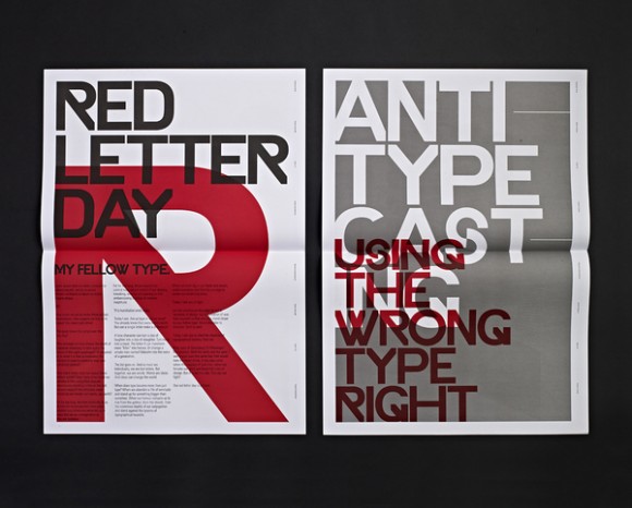
What I like about this poster is the big, bold text. They’ve used a limited colour palette for the whole poster to emphasise the letters to make it more dramatic and make it a focal point. I like how they’ve overlapped the lettering but still able to keep it readable. It’s very ‘to the point’. I think the overall look is quite urban, it reminds me of street art and graffiti work.
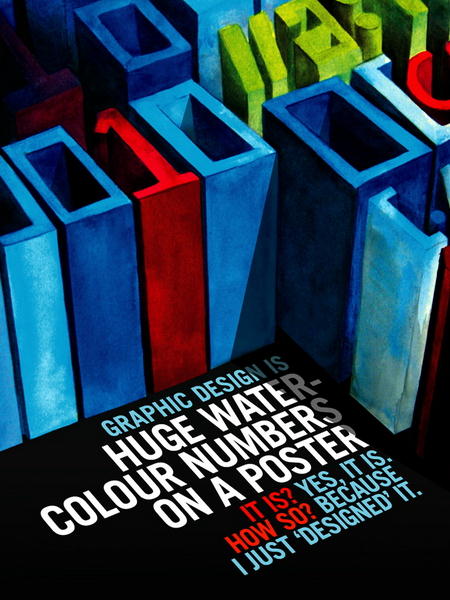
What captured my attention on the next poster is the play of 2D and 3D lettering. I find it rare to see this in generic typography posters these days, they’re normally very blocky, flat and 2D. I just like the fact it is quite a fun and unique design.
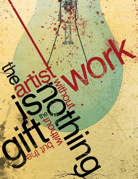
I really love this type of design. I like the whole angling, sizing and colour of words as well as the whole composition of the poster. It looks edgy and modern. I think the lettering is cleverly arranged so that not only does it look good but its also legible. I think this could be very versatile and fun method to play around with.
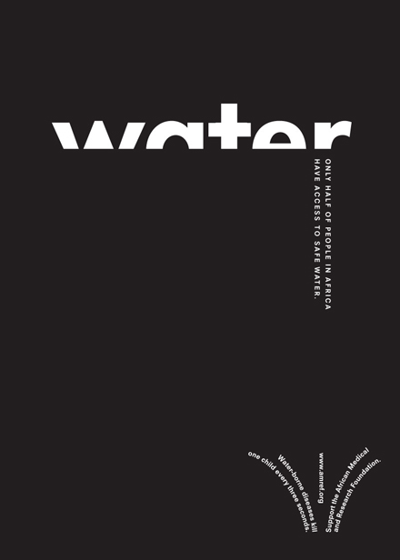
I really like the simplicity of this design. I find the monochromatic design and the cropping of the letters of the title extremely eye catching and bold. The design is intelligent as it matches what the poster is trying to advertise.
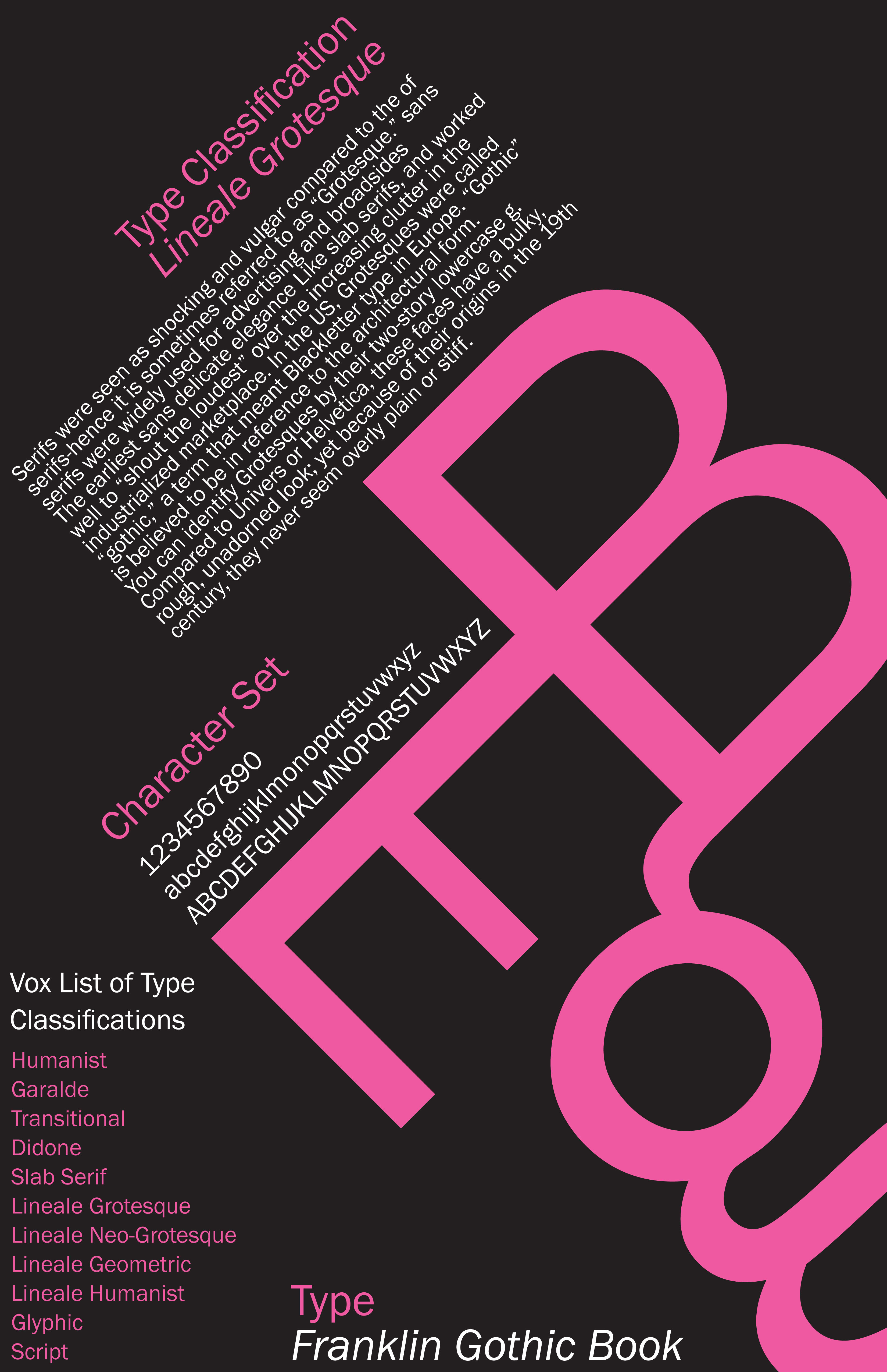
I think this poster best matches what our project brief is all about. It concentrates on the letters of the font as the main focus with the big, bright pink B, E and g. It includes paragraphs of text and the character sets. All of which are nicely displayed with interesting composition. Again, like the first poster, the colour palette is limited to make certain areas stand out and capture the viewers attention drawing their eyes the certain points first.
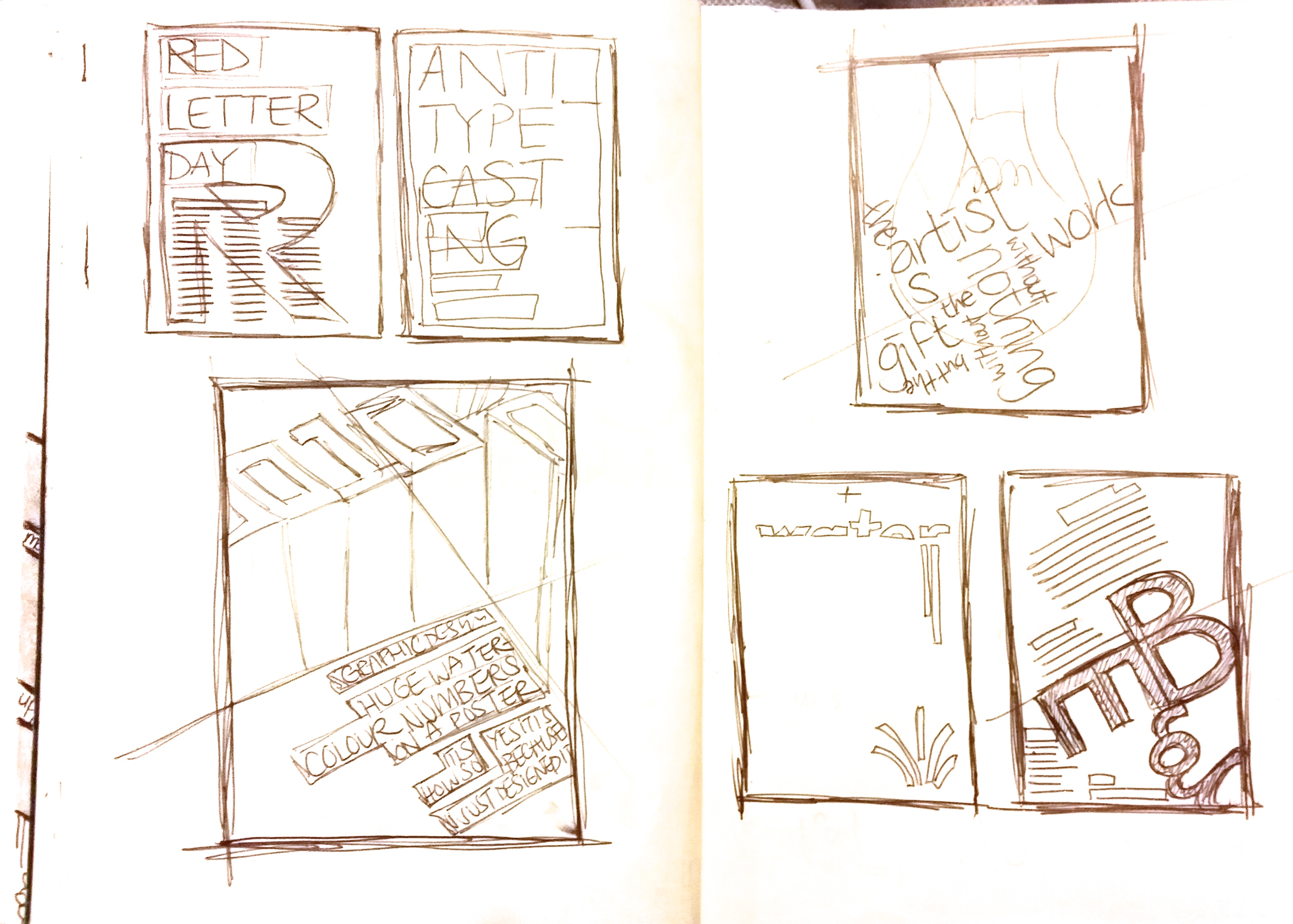
I sketched out the five poster designs very quickly and briefly into my sketchpad just to see the different types of layout. Exploring the different compositions, alignment, angling and various design ideas to hopefully help me construct quick design sketches of my own.
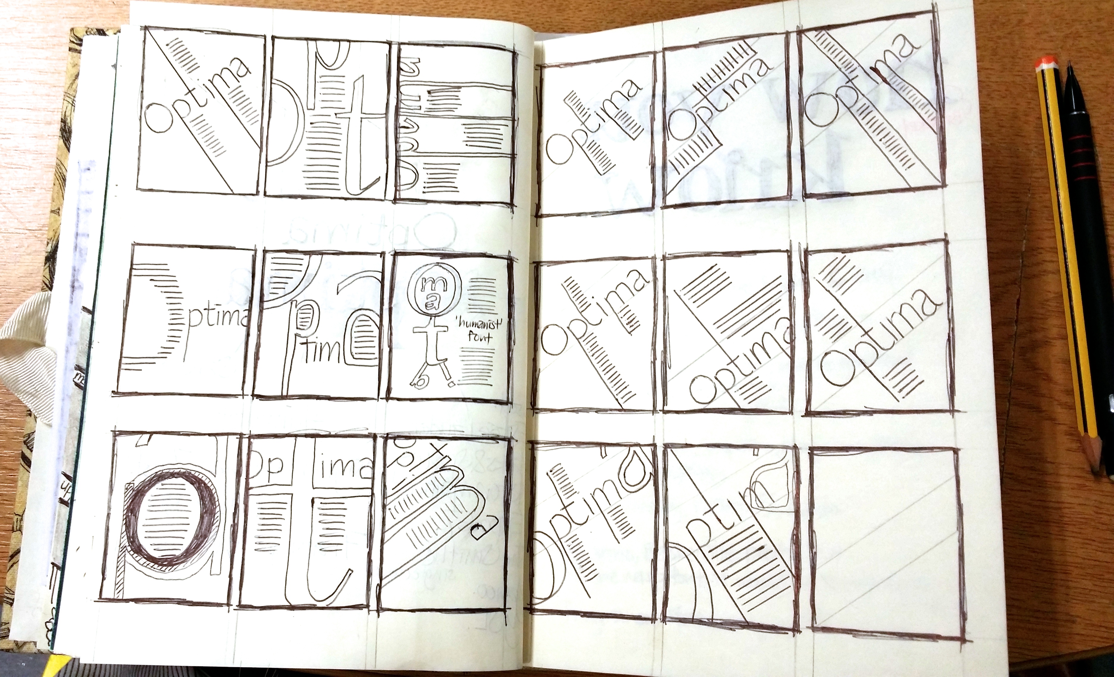
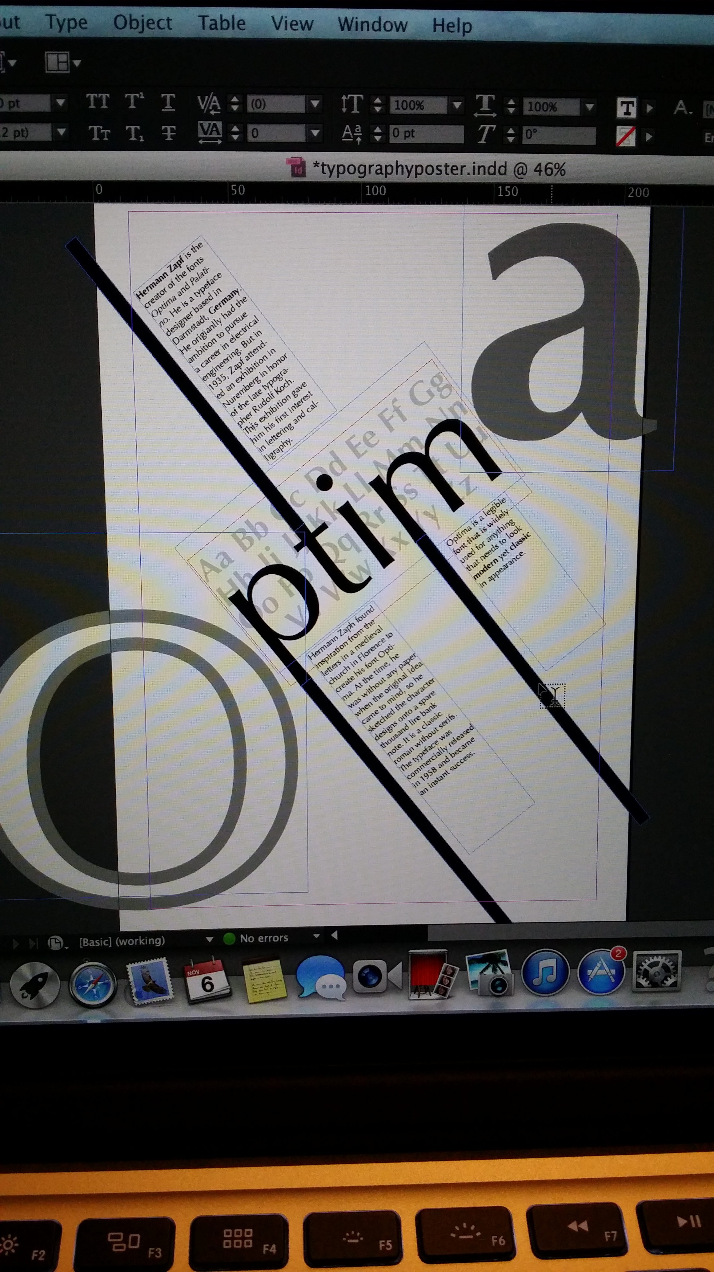
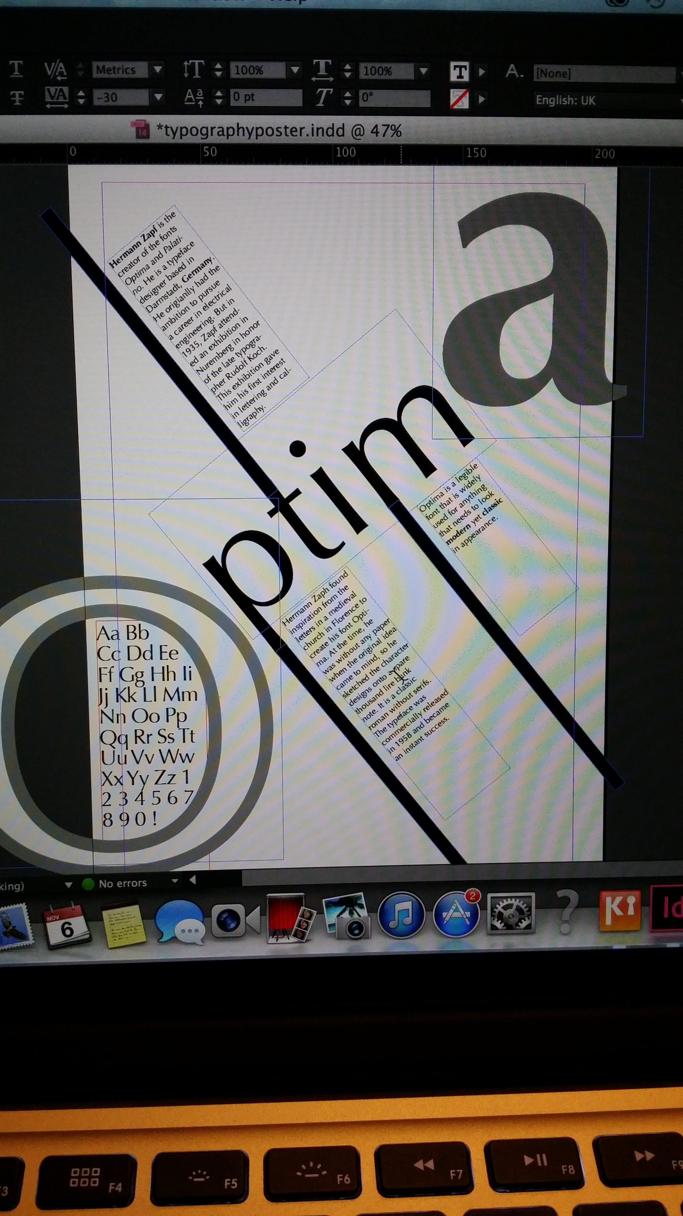
Following from the research work, I created a few thumbnail designs for my font Optima.
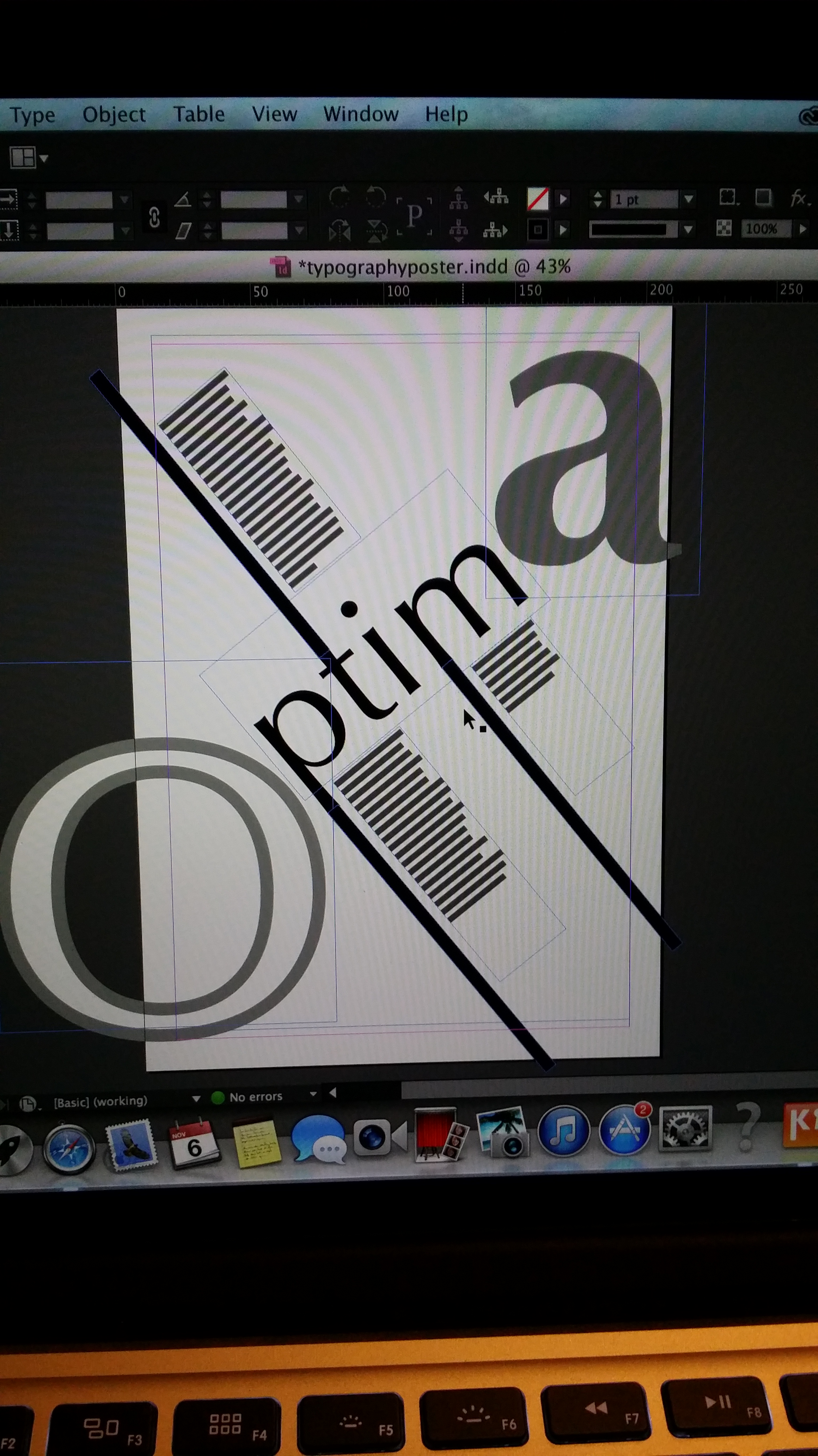
I then transferred and developed my ideas onto InDesign.
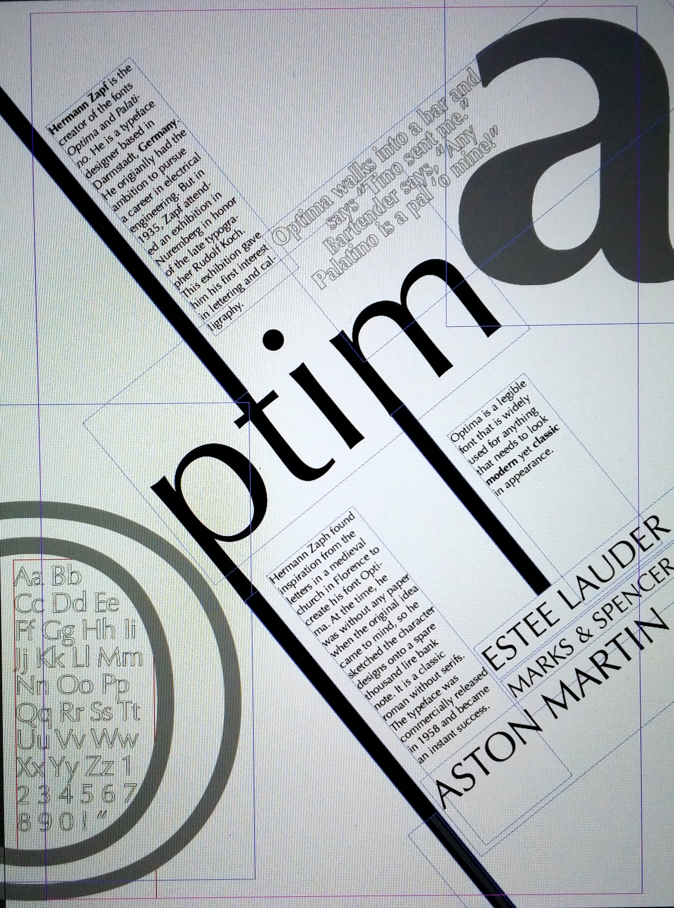
I like my poster but I would like to improve upon it. I feel that not enough lessons or workshops were included for this project. For the last project we had a lot of lectures that connected to the project and useful reviews that built up the the final design. As a beginner in InDesign I really struggled to be creative for this project. It was very restricting as I didn’t fully know how to use the software and was wary of making mistakes, which explains my very simple design. But overall, I think it’s an alright first attempt.
